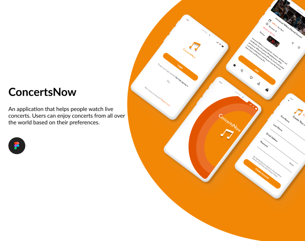
Project goal
The goal is to create a design for a mobile application that offers live online concerts. The app includes recommendations based on user preferences, popular concerts, concerts near the user, as well as information about artists.
The problem
Many concerts have been canceled since the coronavirus pandemic began. Even though they stopped happening, people still want to experience live music.
Live music community, many artists and fans have tried to find ways to bring music to people through livestreams and virtual events mostly on their social media pages.
But those have been bandages rather than a remedy.
ConcertsNow aims to fix that by creating a platform where artists and people who want to listen to live music can meet in a dedicated virtual place for sharing some musical joy.
My role
My role in this project as a UX Designer was to take ownership of the app’s design.
My responsibilities included: user research, wireframing, prototyping, usability testing, iteration, and the creation of a high-fidelity prototype.
Challenges
1.Eliminate barriers to enter the application.
2.Explore concerts seamlessly.
3. Construct a detailed information page for each concert.
Kickoff
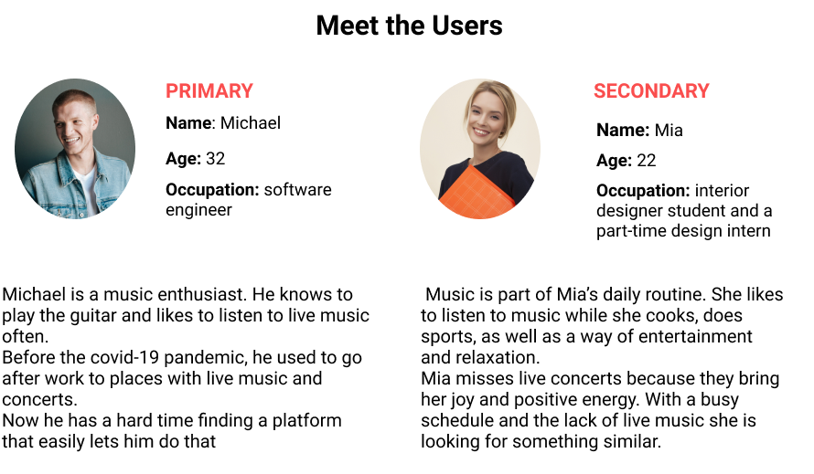
Starting off, I asked myself a few initial questions.
“How could the music industry be helped?”
“How large of a scope do I want this project to be?”
“How is the primary user?”
“What kind of goals do they have?”
“Why would someone want to use this application?”

Competitive Analysis
In order to construct a concise and solid foundation for ConcertsNow, I looked at several potential competing companies to see what they were already doing and what user goals were not reaching.
I found out that there are not so many apps on this subject.
Most of the live streaming concerts are happening on social media and not in a place dedicated only to live concerts (Instagram, Youtube Live and Facebook Live the most popular platforms used by viewers in USA according to statista.com).
Therefore, the most prominent competitors are Stream Live (focused on events/tv and just a few virtual live concerts) and Sessions: Live Music Streaming (but users don’t get to have a sense of the app before paying).
For both applications their payment model is based on tickets.
Besides these two applications, there is stageit.com but it doesn’t have a mobile app.
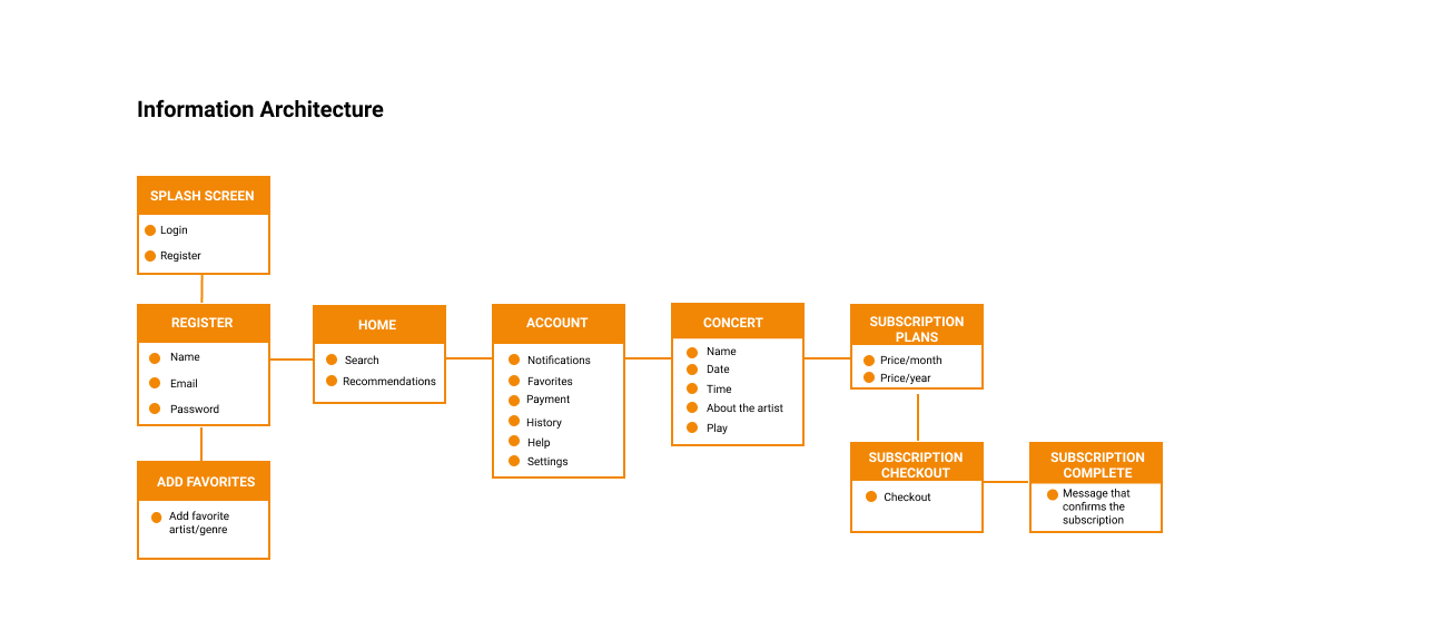
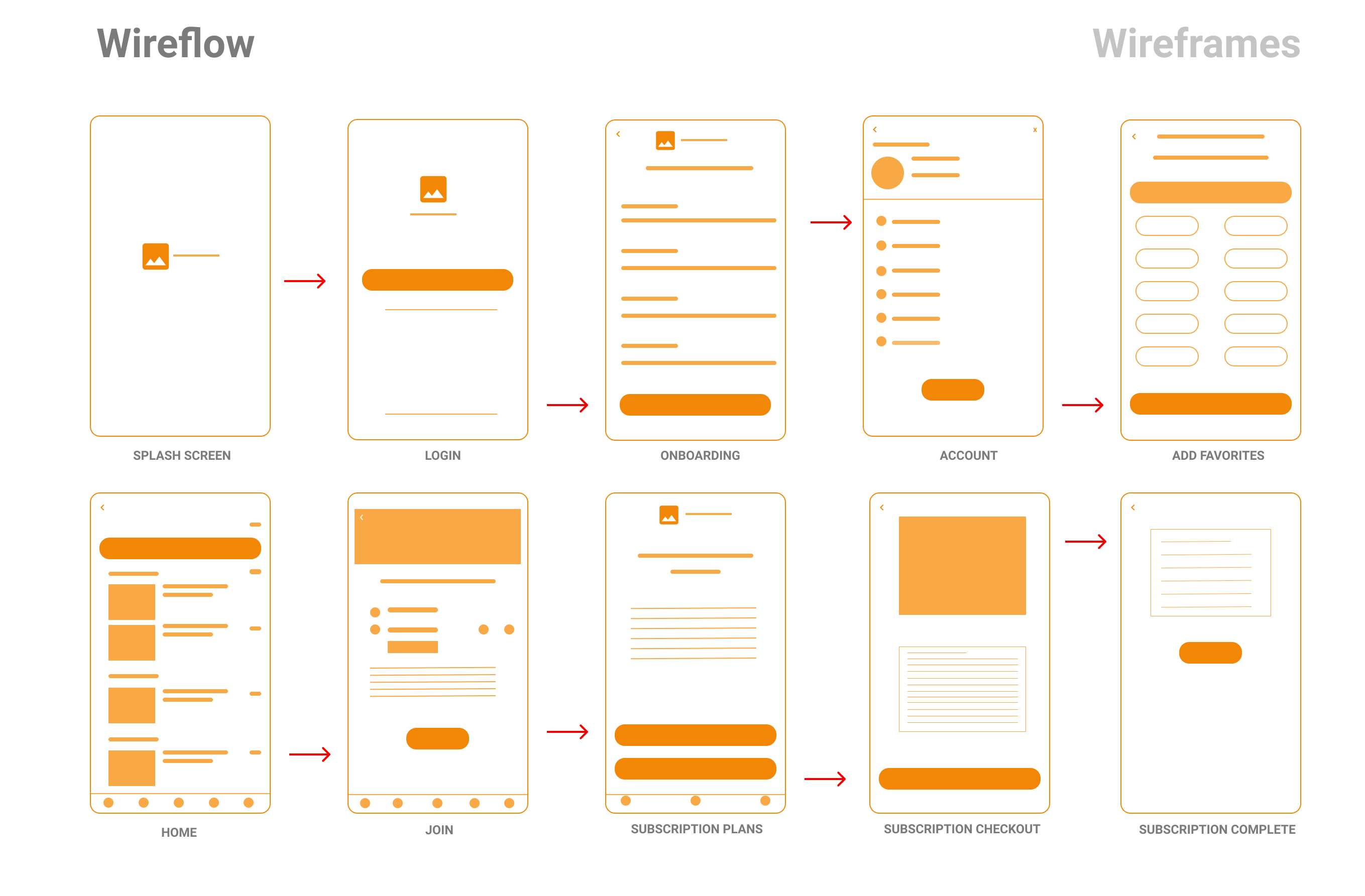
Wireflow
This helps me understand the ways users can interact with the app, as well as to see user navigation through their goals.
Usability testing
After creating the prototype, I conducted a usability test.
I asked 3 participants about the app to gather feedback and to make sure the app is effective, intuitive and satisfying.
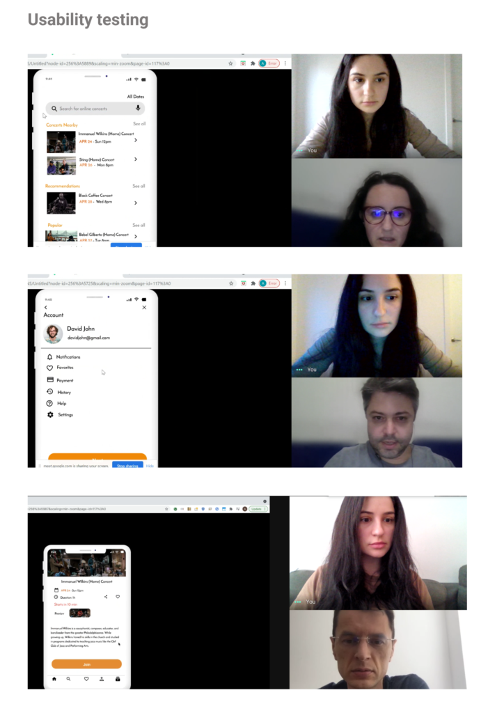
After conducting the usability test, I found out that the participants would prefer to have:
- a screen where users can add favorite artists/genres, so that the application can offer personalized recommendations.
- a preview of how the artist sings before joining the concert.
- a calendar icon next to “All Dates” to make it easier to identify.
- on the last screen the “Join” button instead of going back to the concert.
Final design
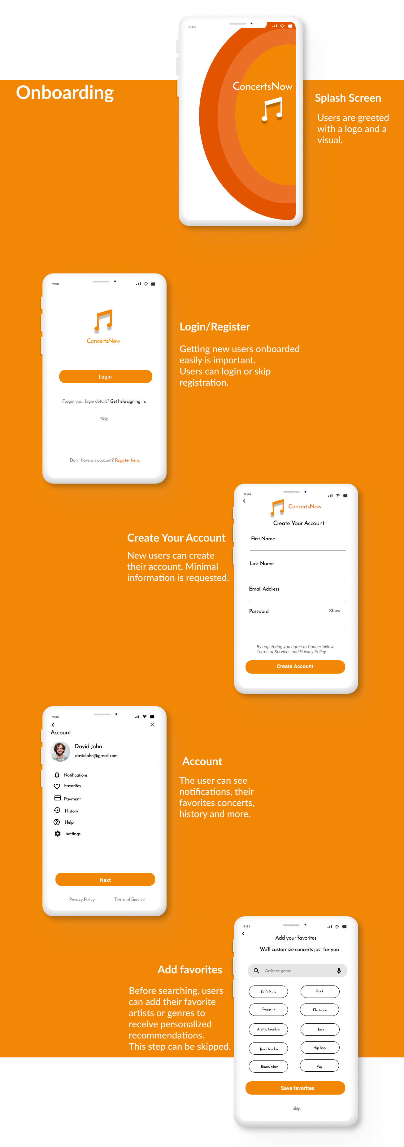
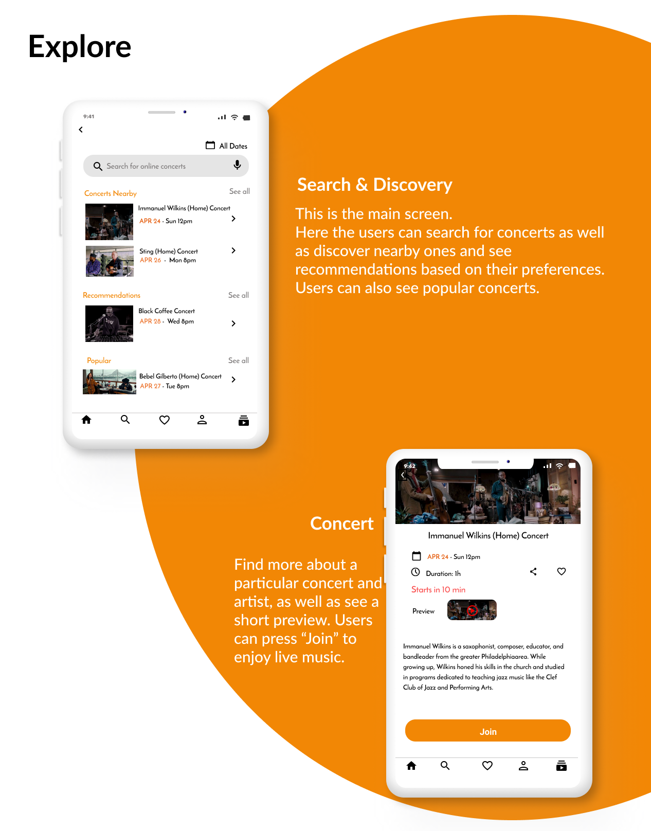
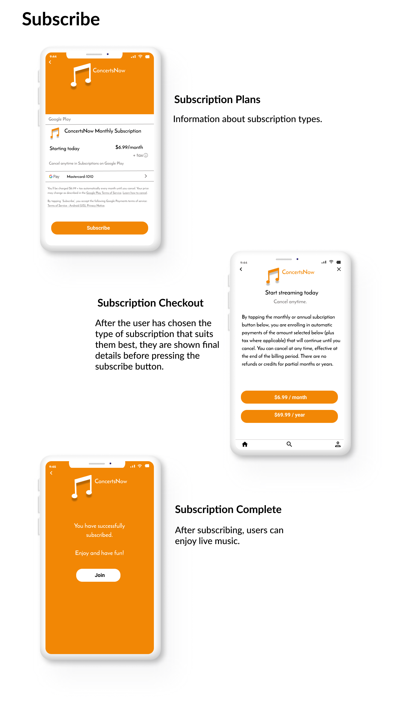
Here is the high-fidelity prototype.
Style guide
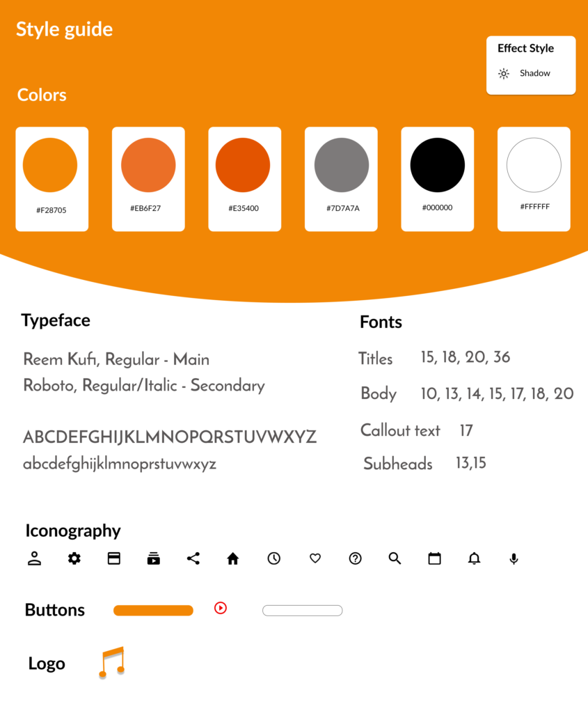
I wanted to create a simple and harmonious design
Utilizing warm colors felt like the perfect for the ConcertsNow branding.
The main color, orange, helps evoke a happy feeling that matches the positive mood given by live music and the something-is-happening-now sensation.
The orange color paired with red, white and black seems to create a nice balance between calm and energetic.
The main typeface of choice for ConcertsNow app is “Reem Kufi”. I wanted to select a sans-serif typeface that will blend in nicely with the app’s design style.
Responsive Web Design
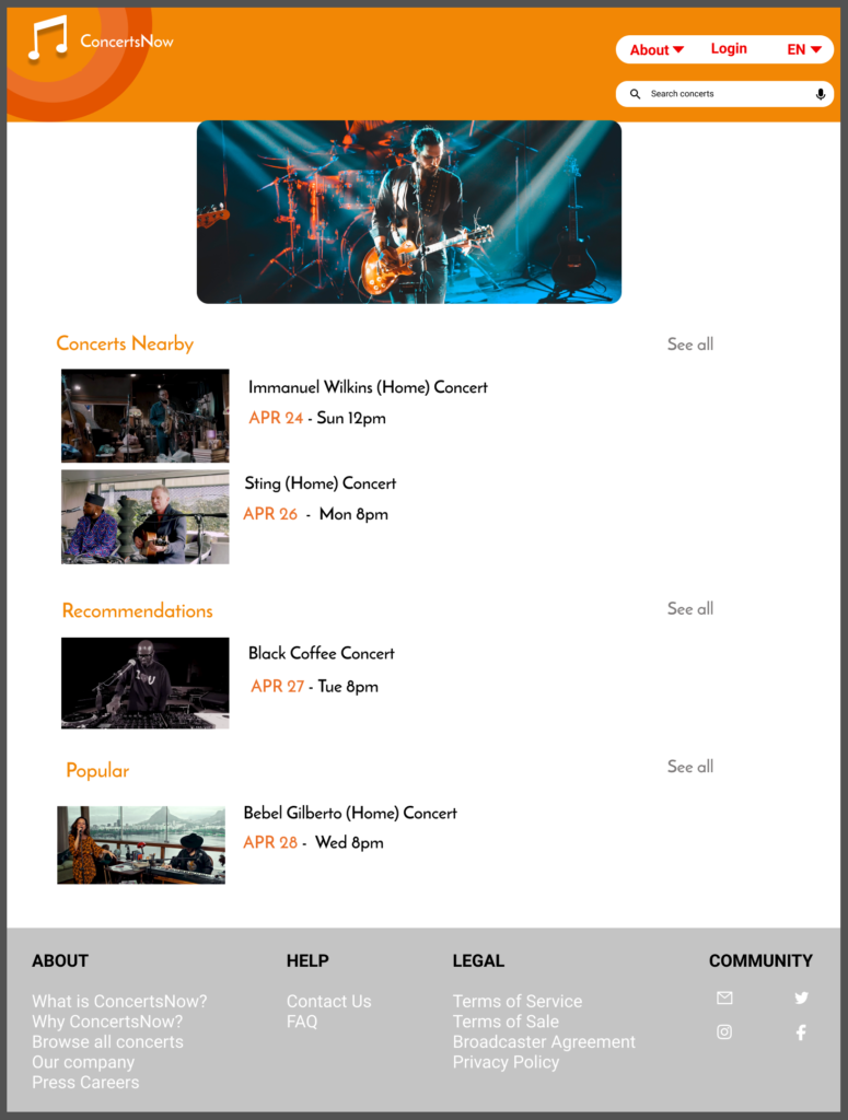
Even though the project focus was to create a mobile app design, I wanted to use responsive web design and create the home page for desktop to see how the user experience can look for people.
Challenge #1
Eliminate barriers to enter the application
A key factor when trying to gain a user base is to create a login screen void of conflicts.
If the users wish to browse the app without an account, they can press the “skip” option from the login screen.
This way helps the users get a better idea about the app and they might be more willing to create an account later on.
Challenge #2
Explore concerts seamlessly
With so many concerts around the world, sometimes it can be overwhelming to find exactly what you want. In addition to the search bar where the user can search easily for his favorite artists or genres, I have created a part where the user can discover other types of concerts.
The discovery part focuses on recommendations based on the user’s preferences, concerts close to his location and popular ones at that time.
By creating these categories, I believe users are able to discover and enjoy more concerts.
Challenge #3
Construct a detailed information page for each concert
Finding more about the concert and the artist is essential for users to read. That’s why I created a short and concise screen. Here users can find more about the date, time, artist (background, photos) as well as having the option to share or add to favorites.
Takeaways
During the usability test I found out interesting points of view and it reinforced that this is a critical step of designing the app.
It was a great opportunity to learn more about user behaviour, their needs and expectations.
I also learned that the research is key. Finding more about the competitors and user profiles gave me a better idea of how the app needs to be designed.