Project goal
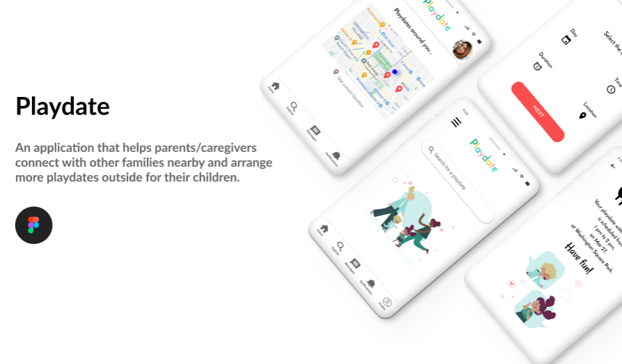
The goal is to create a design for a mobile app that helps parents/caregivers connect with other families nearby and arrange more playdates outside for their kids.
The problem
People often find it difficult to arrange playdates for their kids on a regular basis and connect with new families/caregivers.
Sometimes their schedule does not match the schedule of their friends or when they go out it happens not to find other children of the same age to play with. Other times, to schedule a playdate can take a lot of time and coordination to work out all the details.
So, because of this reason I came up with this idea.
My role
My role in this project as a UX Designer was to take ownership of the app’s design.
My responsibilities included: user research, wireframing, prototyping, usability testing, iteration, and the creation of the final high-fidelity prototype.
Why did I choose this app?
Playdates have been proven to help children strengthen social skills and improve emotional intelligence. They play a vital role in child development.
I believe this a great opportunity to have more playdates, discover and make new friends.
Challenges
- Design a cohesive interface for familiar and unfamiliar users.
- Create a minimalistic UI.
- Provide a seamless & linear experience to schedule a playdate.
Kickoff
In this project, I found qualitative research methods to be the most useful, consisting of literature review, competitive analysis, usability testing, and user persona. I started out by asking myself some initial key questions.
- “What is the product and who is it for?”
- “Which users are the most important to the business?”
- “What challenges could I face moving forward?”
- “Who do I see as the biggest competitors?”
Competitive Analysis
I looked at several potential competing companies.
Most of the apps are dedicated only to mothers or only to both parents, without including other categories of users. (e.g. MamaLeave, MommieGO)
Some of them are video-call playdates (Caribu) and some are focused on hosting playdates for families, when parents are busy. ( Keedoo)
Although none compete directly with Playdate, they can still infringe on the business’ revenue & popularity.
Playdate has the opportunity to capitalize on this by including a wider range of possible types of users. For example, in addition to parents includes caregivers or grandparents.
Meetings are also held outside, which is likely to be more frequent because people no longer have to think about the preparation they have to do before having guests or safety risks.
The main differences that I noticed regarding the structure of the applications were:
- Easily Accessible vs Hardly Accessible (e.g. login with your Facebook/Gmail account vs you can’t use the app if you don’t have 2 different photos, including a real-time selfie)
- Too Many Screens vs Simplified Interaction
- Distracting Interface vs Minimalistic Interface
- Focused on different purposes (hosting playdates, virtual playdates etc)
Preparing the Journey
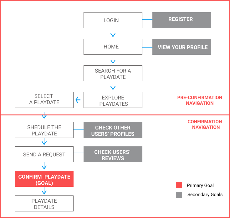
I constructed a user flow for what a basic start to finish journey looks like. This helps me understand the ways users can interact with the app, as well as to see user navigation through their goals.
Wireflow

Iteration
After creating the prototype from low fidelity wireframes, I conducted a usability test with 3 participants. I asked participants to test the prototype in hopes of gathering enough feedback to use for the next set of design iterations.
Final design
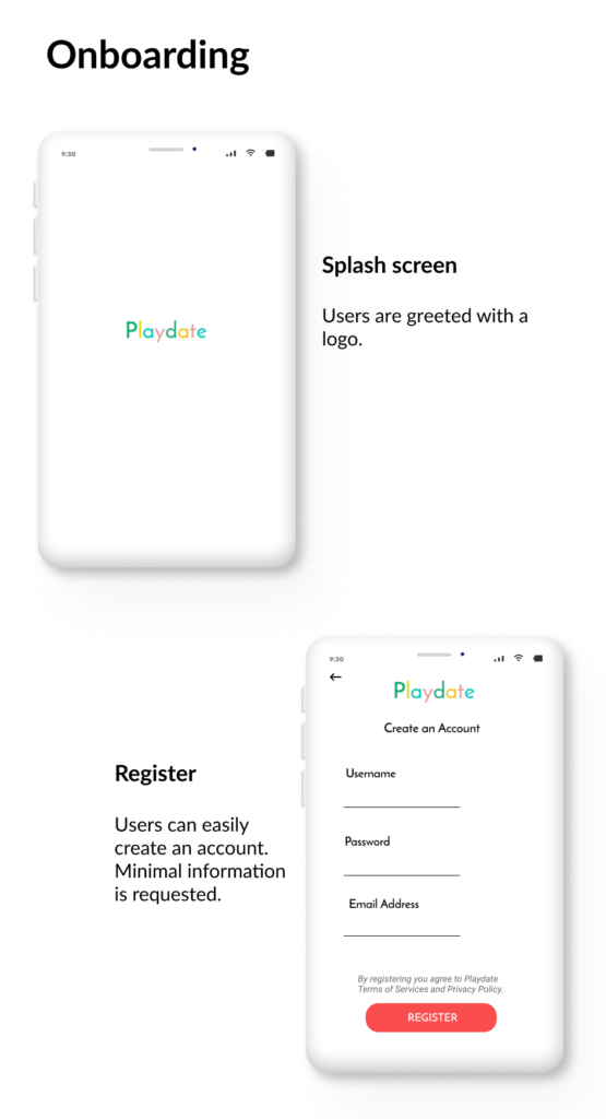
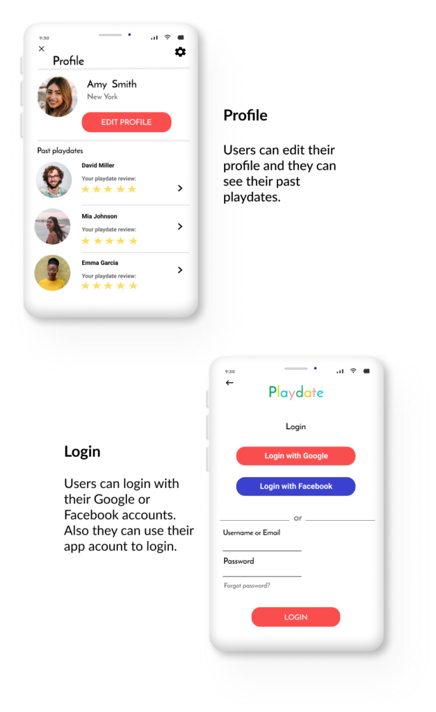
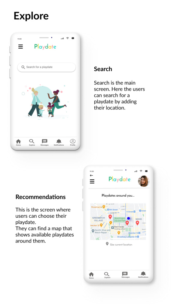
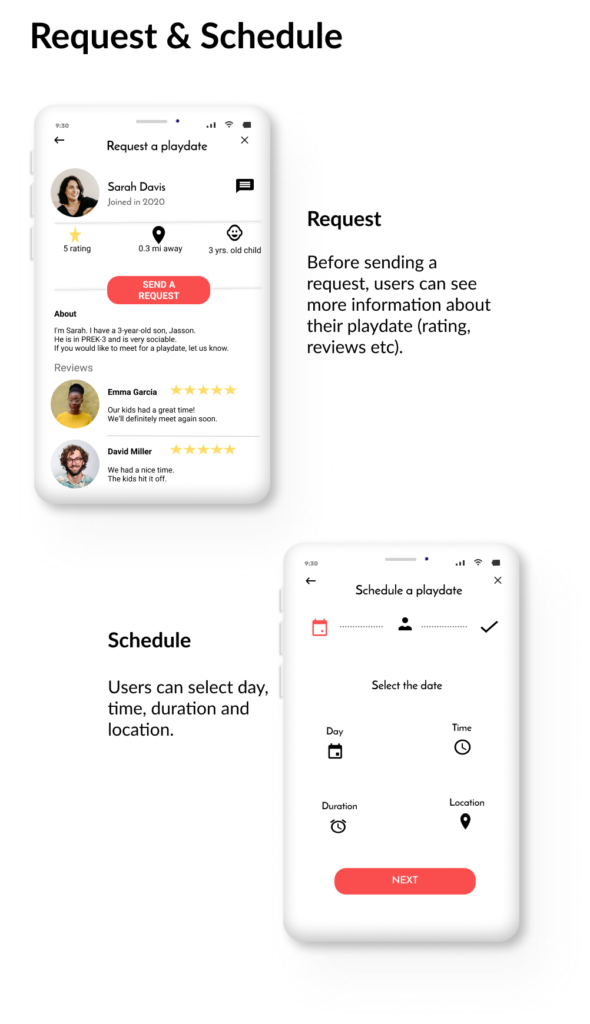
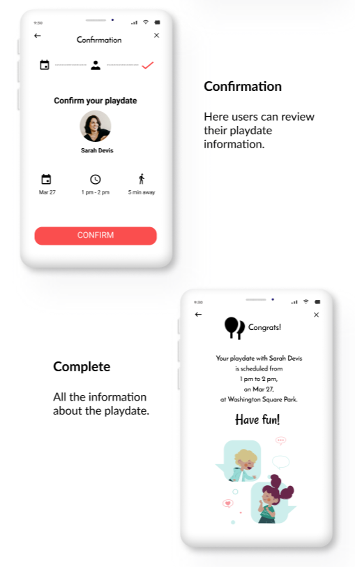
Here is the high-fidelity prototype.
CHALLENGE #1
A familiar experience
Playdate is intended to be used by people with different technological backgrounds (from tech challenged to tech savvy).
With recognizable iconography, intuitive gestures, and a linear schedule process, Playdate is following this criteria.
CHALLENGE #2
Create a minimalistic UI
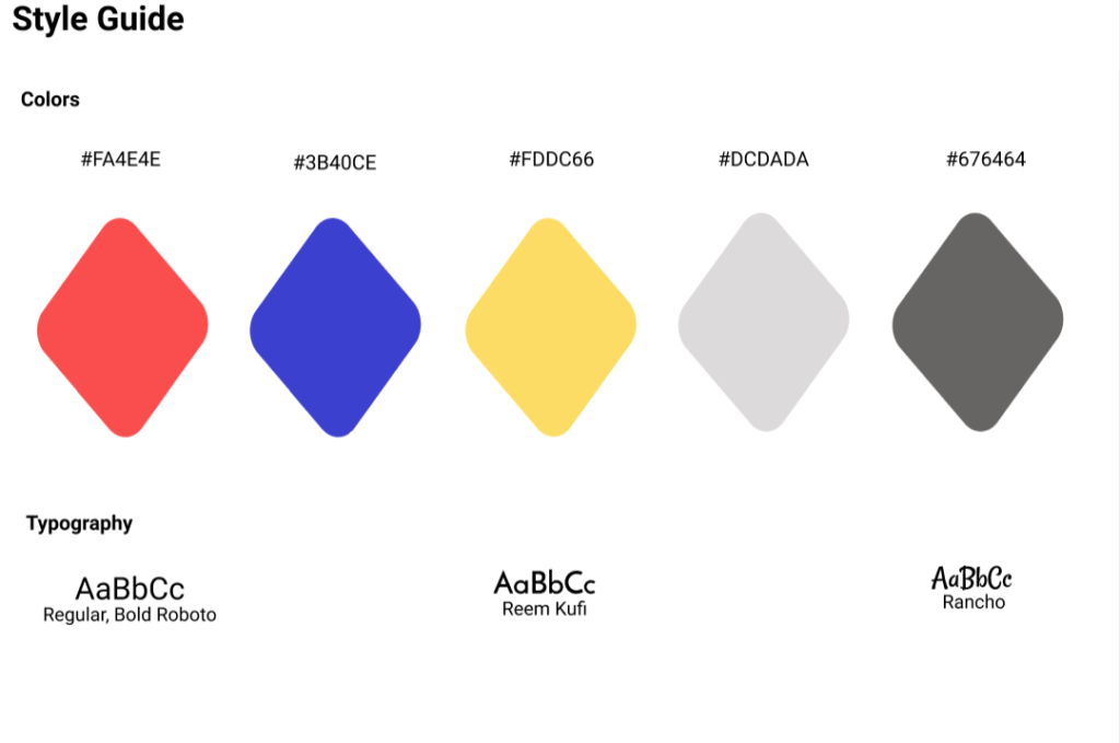
The UI consists of a gray, black and white color scheme with the exception of yellow and red signifiers. Using color sparingly throughout the application’s interface, it allows the call-to-action buttons to be the focus point during user engagement.
CHALLENGE #3
A seamless & linear experience
The design allows for minimal screen usage and a quick schedule and confirmation. For example, the send a request screen and user description are being accessible within a single screen.
Also a key factor: the login options, which can be possible by creating an account or using a Google/Facebook account.
The whole process is quick and simple, which gives users an easy way to schedule a playdate.
Takeaways
Playdate as a concept is something that I feel society would greatly benefit from and this idea is near and dear to my heart.
While designing this app, I learned that the designing process goes way deeper that it may seem. The first idea I had was just the beginning of a discovery and improvement process.